LITEMED — Rebranding
寶健科技|品牌識別設計
Year
2024
Client
LITEMED
Services
Branding
Package
Key Visual
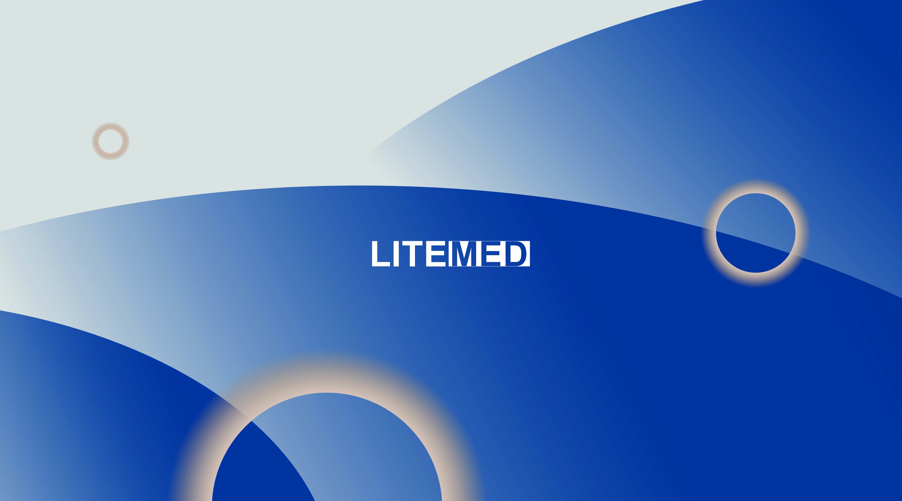
專注於精準醫療的 LITEMED 寶健科技,本次識別設計以「波能聚焦」為靈感,將震波與能量傳遞轉化為流暢的弧線與光環。
透過深邃寶藍與微光漸層的堆疊,我們在理性嚴謹的生技醫療與感性溫柔的健康關懷之間取得完美平衡。以極簡、精準的視覺語言,為企業塑造邁向國際的當代品牌氣場。
For LITEMED, a pioneer in advanced medical technology, the new brand identity translates invisible energy—shock waves and light focus—into a refined visual language.
Dynamic overlapping arcs represent the precise transmission of treatment waves, while the soft luminous ring symbolizes pinpoint accuracy and holistic care. Rendered in a deep, authoritative royal blue with glowing accents, the design seamlessly bridges high-tech medical innovation with human-centered empathy, elevating LITEMED’s presence on the global healthcare stage.

Design Concept
Visual Symbol
柔和漸變的弧線象徵波能的精準聚焦與綿延擴散;微光的圓環意象則代表著「聚焦定位」與「生命的圓滿守護」,展現高科技醫療下的溫柔關懷。
Color Palette
主色選用深邃而精準的寶藍色(Precision Royal Blue),傳遞頂尖醫療技術的專業、信任與安定感;搭配暖光質感的發光微色階,平衡了醫療設備常見的冰冷感,營造如沐光彩的生命力。
Application
從形象畫冊、戶外展演到品牌周邊,視覺語言以簡練的線條與大氣的留白鋪陳,為專業醫療品牌注入優雅、當代且國際化的永續姿態。