MIMART — Branding Design
台時網購|品牌識別設計

Year
2019
Client
MIMART
Services
Branding
Key Visual
Package
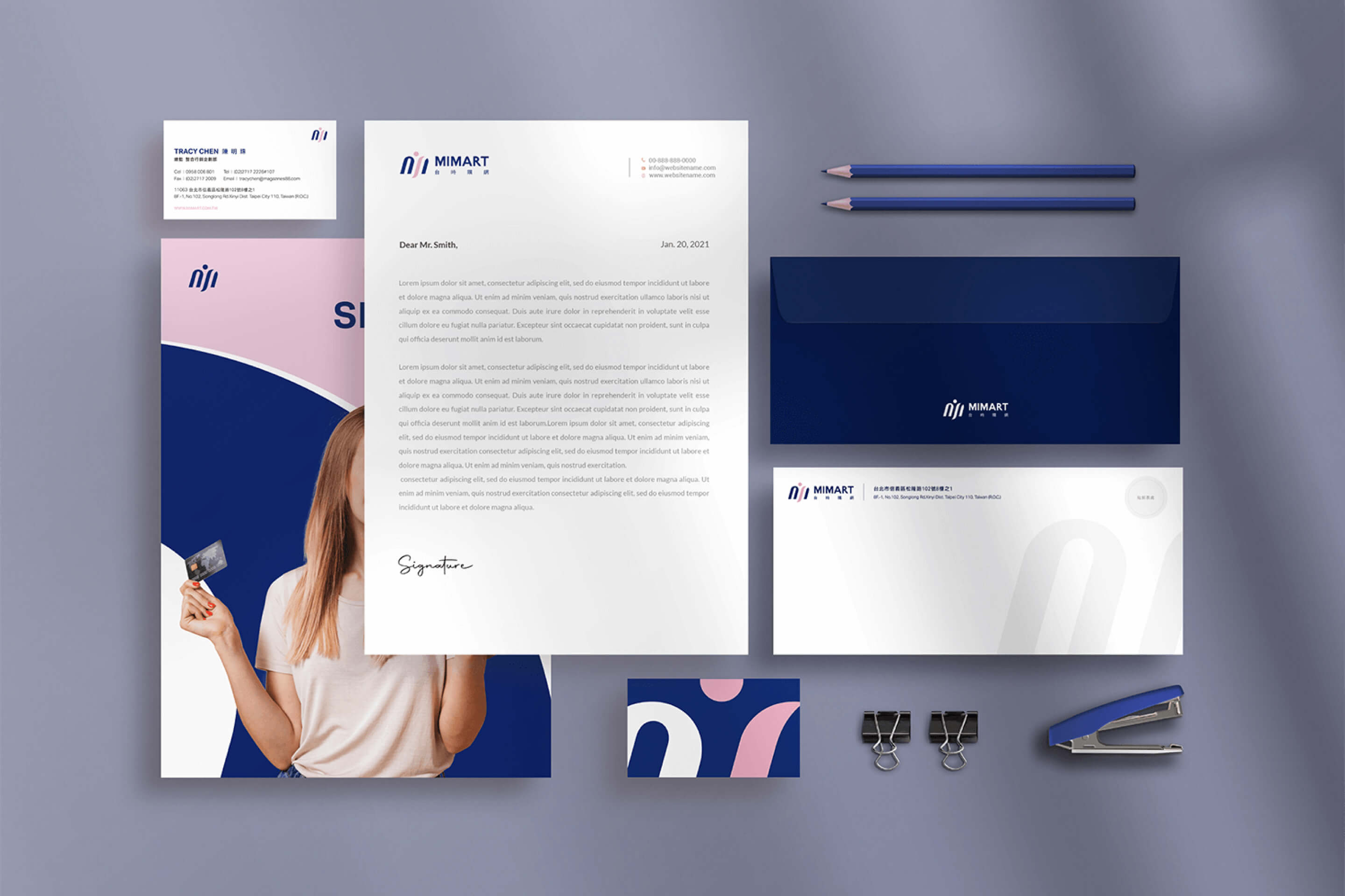
專注於便利電商體驗的 MIMART 台時購網,本次識別設計以「人本連結」為靈感,將品牌字母與購物者的意象轉化為流暢的拱型線條與躍動圓點。
透過深邃寶藍與暖意粉橘的對比堆疊,我們在專業可靠的商業理性與溫暖親切的顧客關懷之間取得完美平衡。以極簡、活潑的視覺語言,為企業塑造現代且具國際感的電商品牌氣場。
Focusing on seamless and accessible e-commerce experiences, the brand identity design for MIMART is inspired by the concept of "Human-Centric Connection." The brand's letterforms are transformed into fluid arching lines and a dynamic dot, evoking the image of a shopper and a welcoming bridge.
Through a balanced interplay of deep navy blue and warm peach coral, we achieve a harmonic synthesis between professional business reliability and warm customer care. Using a minimal yet vibrant visual language, this identity crafts a modern, approachable, and internationally minded brand presence.

Design Concept
Visual Symbol
流線型的弧線象徵順暢無縫的購物體驗與服務連結;頂部的圓點與拱型意象則代表著「以人為本」與「貼心守候」,展現數位電商平台下的溫暖關懷。
Color Palette
主色選用深邃穩重的寶藍色(Navy Blue),傳遞商業平台值得信賴的專業與安定感;搭配暖意滿載的粉橘色(Peach Coral),平衡科技與零售常見的生硬感,營造親切活潑的品牌生命力。
Application
從商務名片、企業信函到品牌周邊與宣傳畫冊,視覺語言以簡練的線條與大氣的留白鋪陳,為現代電商品牌注入優雅、當代且極具識別度的新姿態。